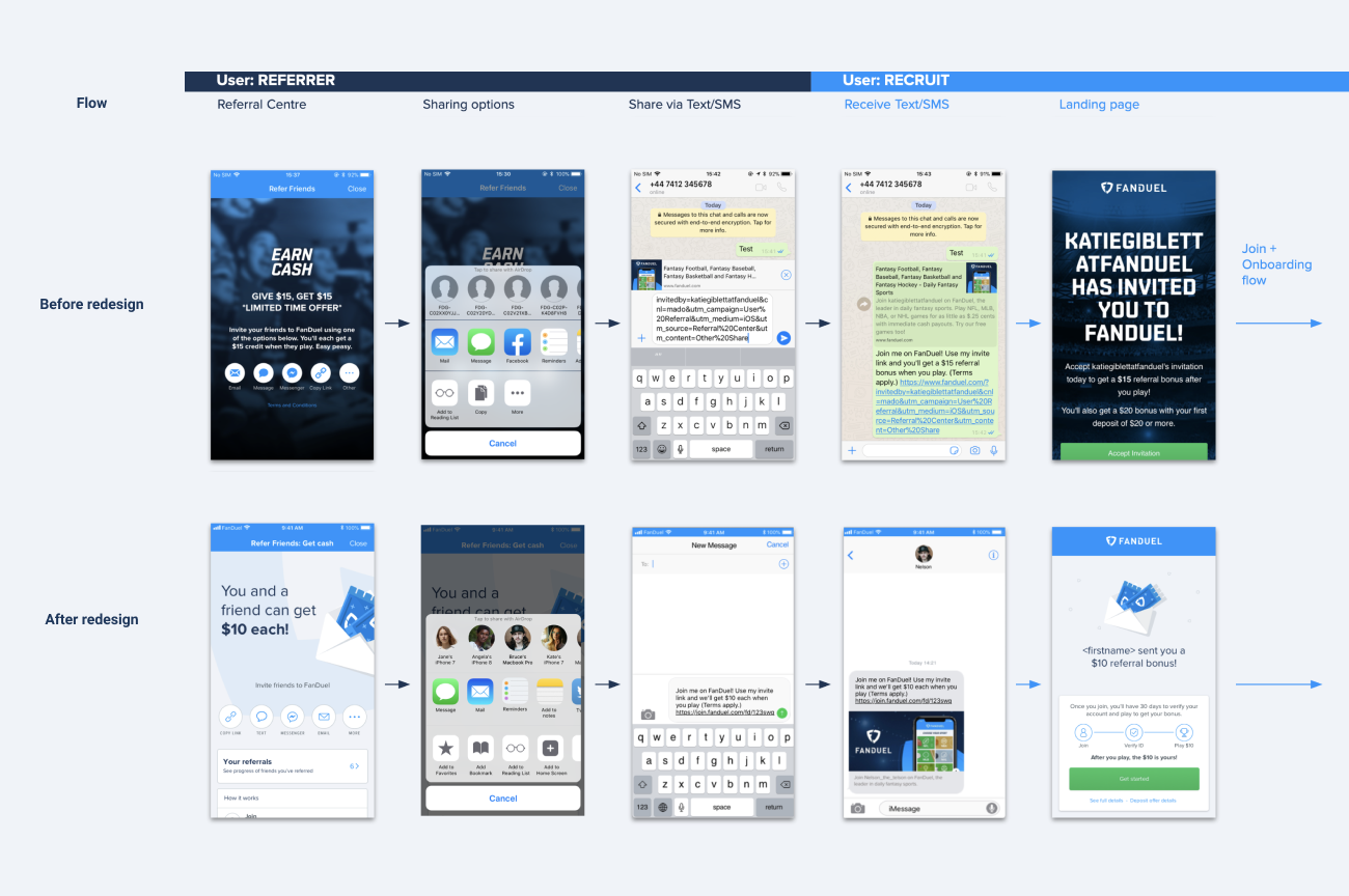
Part of this project involved an audit of the existing user flows across all platforms (web, iOS and Android) - mapping these flows and the screens users were shown during each use case.
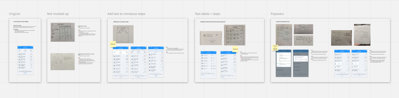
I facilitated a sketching session with the goal of generating possible concepts to explore which helped to narrow down possible solutions. From sketches, the designs moved towards high fidelity prototypes which went through 2 rounds of usability testing with iterarions in between. Each research session uncovered additional UX recommendations that were applied to the designs in order to reach the solution that was shipped.
What we changed and why:
Referral centre
• Added visible share targets (based on preferred share methods per platform) - this made it easier for users to share their referral link via the most convenient method for them
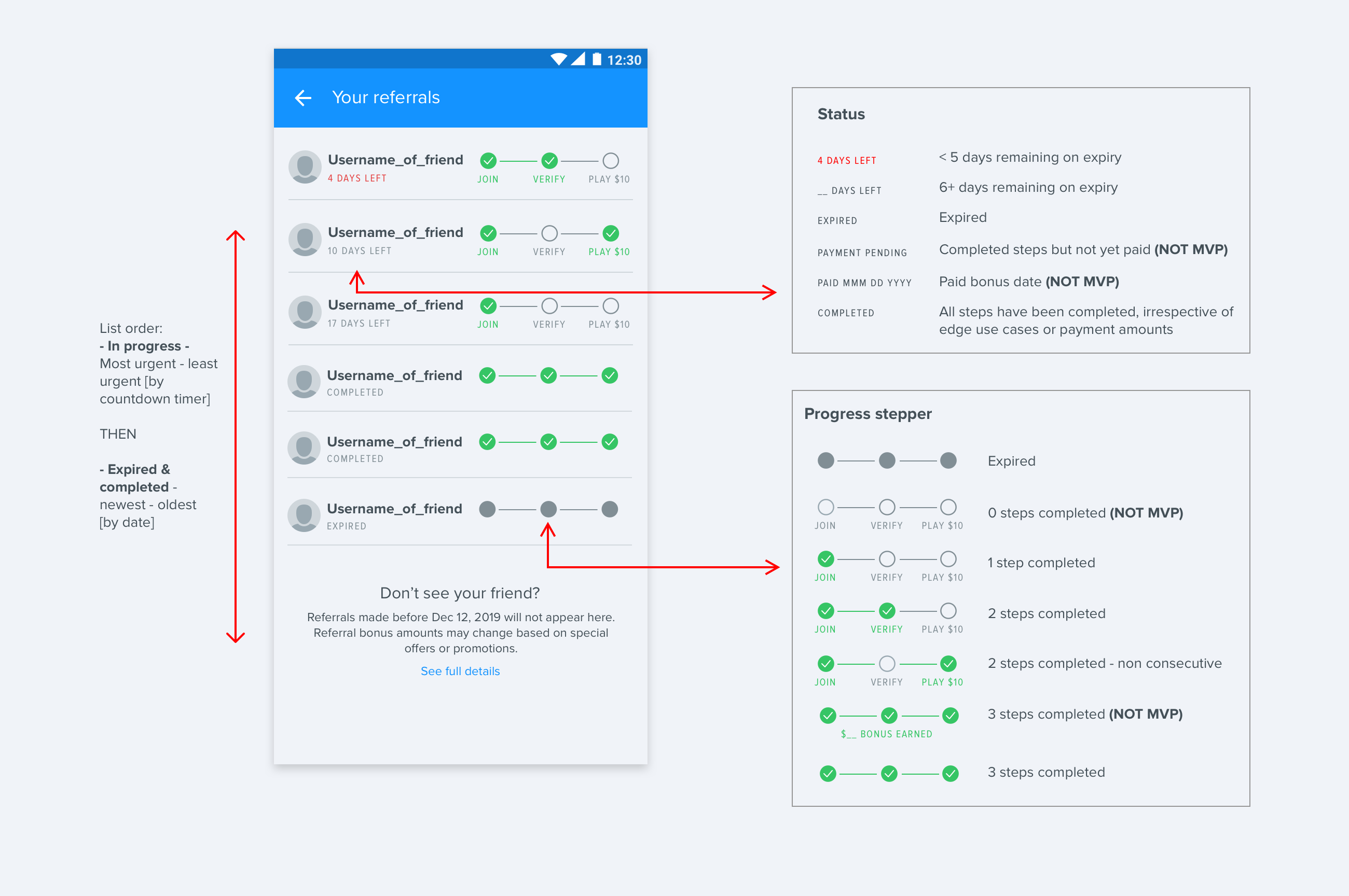
• Ability to track friends referred (including steps complete/incomplete & days until expiry) - this helped to solve the identified pain point that users did not know if their friends had signed up or if/when they would receive their bonus. By adding tracking, users could see which friends had used their link and how many steps they had remaining before both parties would receive their bonus cash.
• URL shortening - this made it easier to copy and share referral links. Before URL shortening, referral links were so long that they took up the majority of the screen on small devices when sent via messaging services, making it difficult for users to add instructions or personal messaging alongside the link.
• Increased visibility of referral scheme steps - This reduced the ambiguity around what a user needed to do in order to receive their bonus, and simplified the steps required into 3 easy to achieve goals.
• Ability to send referral links via server-side email on web - This increased visibility of users through flow for the business, with customer service teams being able to see how many users took action on referral invites sent via email.
• Improved clarity through copy - The teams UX writer revised all copy visible to users, to make it easier to understand
Landing pages
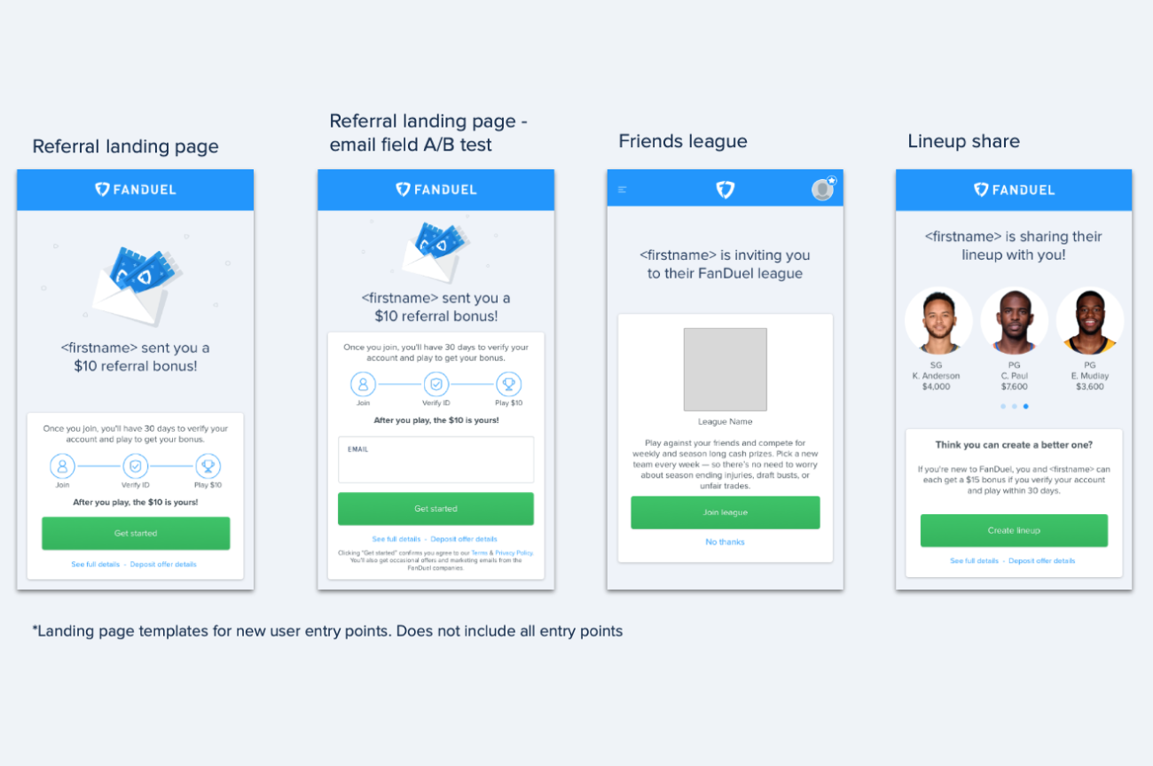
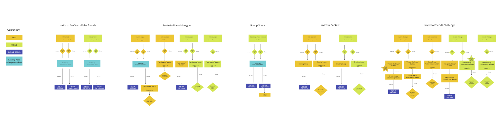
• Added dedicated landing pages - As well as improving the landing page experience for new users who had been referred directly, we also added referral messaging for new users who may have been indirectly referred (clicked on a contest invite, lineup share or league invite).
What we changed and why:
Referral centre
• Added visible share targets (based on preferred share methods per platform) - this made it easier for users to share their referral link via the most convenient method for them
• Ability to track friends referred (including steps complete/incomplete & days until expiry) - this helped to solve the identified pain point that users did not know if their friends had signed up or if/when they would receive their bonus. By adding tracking, users could see which friends had used their link and how many steps they had remaining before both parties would receive their bonus cash.
• URL shortening - this made it easier to copy and share referral links. Before URL shortening, referral links were so long that they took up the majority of the screen on small devices when sent via messaging services, making it difficult for users to add instructions or personal messaging alongside the link.
• Increased visibility of referral scheme steps - This reduced the ambiguity around what a user needed to do in order to receive their bonus, and simplified the steps required into 3 easy to achieve goals.
• Ability to send referral links via server-side email on web - This increased visibility of users through flow for the business, with customer service teams being able to see how many users took action on referral invites sent via email.
• Improved clarity through copy - The teams UX writer revised all copy visible to users, to make it easier to understand
Landing pages
• Added dedicated landing pages - As well as improving the landing page experience for new users who had been referred directly, we also added referral messaging for new users who may have been indirectly referred (clicked on a contest invite, lineup share or league invite).